After a Decade of Empowering Women, Chica Brava is All Grown Up
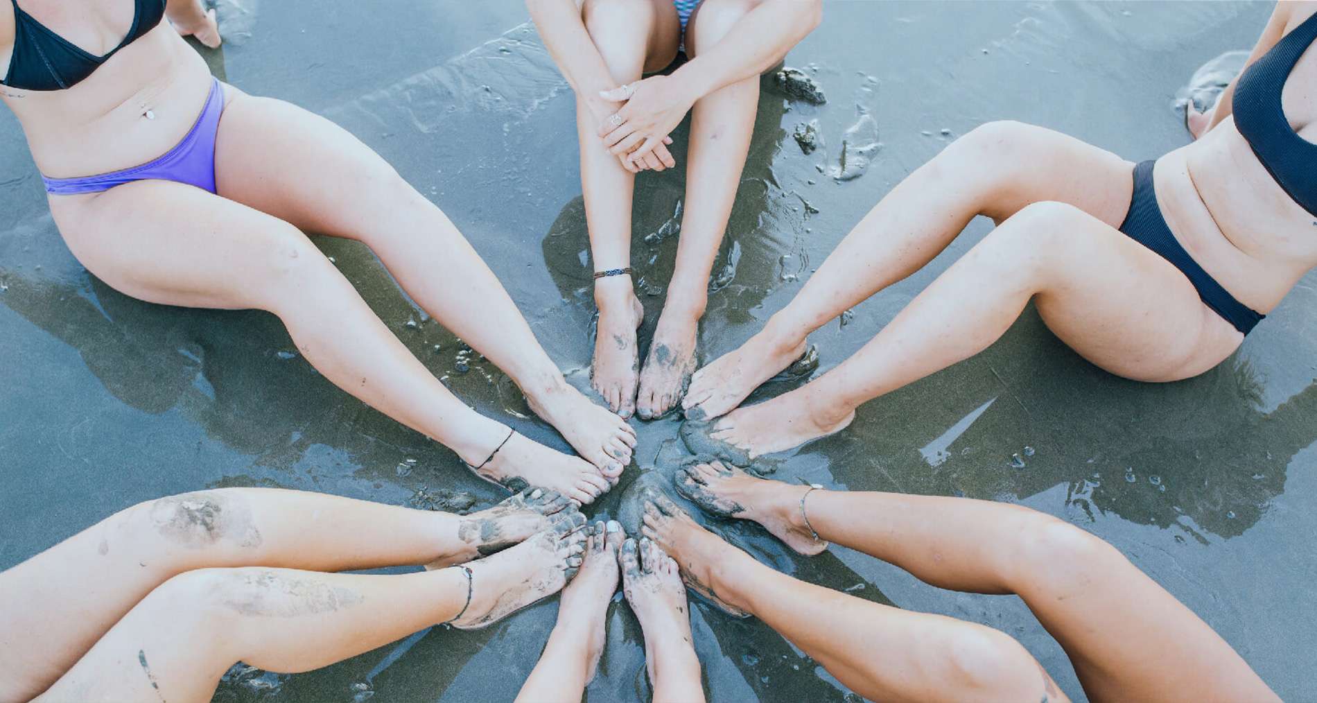
Ever since Chica Brava opened its doors in fall of 2007, its been committed to empowering women through surfing and the genuine camaraderie that comes through this shared passion. In the same way we’ve invested in the women who have evolved through surfing, now is the time for us to invest in ourselves and equally evolve through our brand.
That’s why we’re excited to announce the rebrand of Chica Brava and the relaunch of our website, chicabrava.com. Admittedly it was hard to let go of the girl-in-the-curl logo, especially after a decade of brand recognition. But Chica Brava has grown and matured into something more life-giving than we ever imagined. We felt compelled to express that transformation with the world.
![]()
Leaning on the skills of Sia Brands, our team hired Creative Director Maryam Siahatgar to share her professional insight. We wanted a look and feel that was feminine yet courageous and empowered yet light-hearted. After reviewing dozens of comps and designs, we finally selected a two-font logo with a sleek “modern” surfboard.
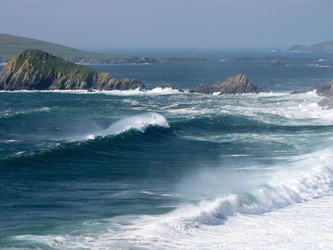
Inspired by the ocean, sand, and sky, Maryam choose a gentle and soft color palette with muted pinks and blues. For typography, she recommended Antro Vecta and Avenir Next, both cool and unique fonts aligned with our identity. Best of all the new logo is clean, timeless, and transferrable across various mediums and platforms—from business cards and tank tops to social media and websites.
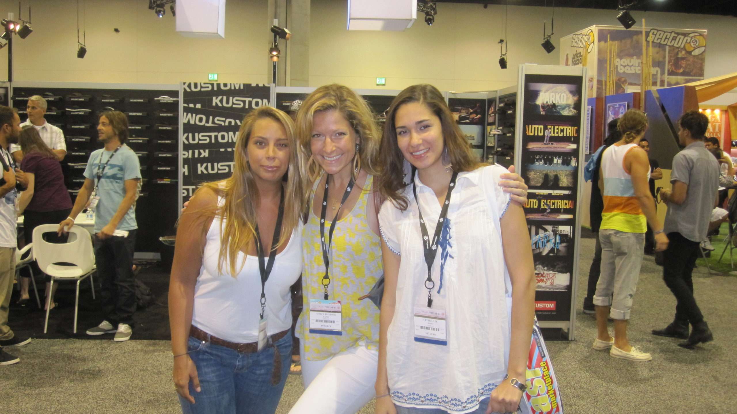
“The new logo feels so much cleaner, stronger, and awesome,” says Chica Brava Founder, Ashley Blaylock. “We wanted something fresh and contemporary that really spoke to people who interacted with our brand and visited our website—something that could give them a glimpse of the uniqueness of the program’s life-changing possibilities.”
Once the rebrand was finalized, Sia Brands Content Manager, Marlise Kast-Myers, shaped the messaging and tone. The goal was to create a voice that was kind, empowering, supportive, strong, positive, and carefree. It became a fine balance between expressing freedom, youthfulness, and adventure without coming across as a teen-focused surf camp. We wanted to express soul, inspiration, and transformation without sounding like a yoga retreat. Most importantly we wanted to share the sense of courage, confidence, and capability without appearing to be a surf destination exclusively for hardcore surf professionals.
“We strived to balance the three concepts of freedom, soul, and empowerment without one dominating the others,” explains Marlise. “A key element in a full rebrand such as Chica Brava is to assure that the content compliments the client experience. As a previous guest of Chica Brava, I really wanted to reflect some of those ‘takeaways’ in the copy, such as friendship, personal growth, and investing in yourself.”
The final tone Marlise selected is one that is confident, fun, spirited, and inviting. After copy and a site map were finalized, Maryam tapped into Chica Brava’s photo library for images that echoed the voice, style, and tone of the brand. To soften borders and break up copy, Maryam overlaid webpages with sketched foliage that matched Chica Brava’s color palettes. Design files were then released for web development by Thrive Agency, a full-service digital marketing agency with offices in Dallas, Orlando, and Myrtle Beach.
It’s now our honor to share the new-and-improved Chica Brava design with you. Despite these changes, and a decade in the making, we’re forever committed to bringing profound and personal change through support and accomplishment both in and out of the water. We invite you to connect with us in 2018 for a chance to feel empowered, challenged, and capable of more than you ever imagined.